The Newly Designed Logo Looks Great – But Is It Designed Properly?
Remember that last-minute fumble when printing your logo for a Tradeshow? What a Nightmare!
It looked great on your Macbook, but it caused massive delays and extra costs before a print deadline, because you trusted the “I can design your logo for $99” designer…
📈 Your Corporate Branding Is Your Most Critical First Impression—Don’t Get It Wrong
The image your company conveys to its customers and stakeholders is absolutely paramount. You only get one chance to make a first impression, and you don’t want to mess up that precious make-or-break moment.
Pubcos Cannot Ignore the Impact of Retail Investors Anymore
“Remember the Gamestop short squeeze theatre? The retail investors now have a big say in your share prices.”
The old days of “Wolf of Wall Street” (the movie, of course) where dozens of phone calls could secure investments are long gone. Today, a vast array of different stakeholders, from institutional investors to retail traders, will defer to a Google search or an AI query to research your company.
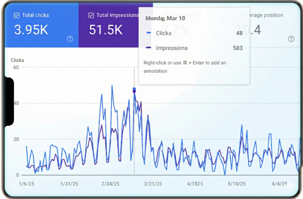
Organic search surged alongside stock promotion campaigns
Investors were googling the company name when newsletters were released.
Remember the Gamestop short squeeze theatre (that later became a blockbuster movie)? The retail investors now have a big say in your share prices. The public will judge the book by the cover, and you need to have a damned good cover design these days. Every brochure, presentation, pitch deck, tradeshow display, and even an internal report will showcase your logo and branding.
New Ventures Need All The Momentum From the Start
For specialty companies—especially in medical, technology, and B2B sectors—comprehensive and consistent branding is necessary to make a mark in an increasingly competitive global market. Potential customers and leads will look you up on Google and social media first, and every missed brand awareness opportunity is loss of momentum in a competitive world of new businesses.
Well-designed brands are effortlessly applied across different mediums, looks consistent online and offline, ensuring your business identity is conveyed impactfully. Each opportunity is worth a lot of money, especially for the newer smaller companies, and here are some tips to help you do it right, and avoid a lot of time and money losses later.
Check out our 3 branding mistakes to avoid (and what to do instead) to ensure your logo never loses visibility (and save you a lot of cash)!
🛑 Logo Design Pitfall 1: Choosing Hand-Written or Overly Stylized Typefaces (Fonts)
Unless you’re a high-fashion retailer or an indie movie producer, stay away from hand-written typefaces. Keep the Star-Trek like fonts on EDM album covers. Medieval style belongs on Game of Thrones posters. With very few exceptions, your primary logo should utilize bold, clean, and easy-to-read typefaces.
Easy Does The Job – Remove Resistance or Barriers From Logo Design
Your logo must be instantly legible at a first glance, even from far away. Assuming nobody knows you (yet), can they read your name at first glance? Hand-written or excessively techy/digital fonts are just hard to read. It’s a competitive world of start-ups and new ventures. Anything difficult creates a subconscious rejection – not what founders of new companies want.
While the goliaths like NVIDIA can afford a stylized logotype because they are already deeply established, new companies must prioritize ease of reading and memorization. Your design needs to work for you, not against you, in building recognition.
Take a look at the branding revamp we did for Arbutus Medical (Vancouver, BC), as well as Nova Pacific Metals Corp’s website we launched in 2024, and see how easy it is to read and soak in the brand names.
📱 Logo Design Pitfall 2: Failing to Implement Responsive Logo Design
The days of simply putting a wide logo on a sign and a fax header are long gone. Your logo has to be as versatile as an octopus. We can no longer assume your logo is only in a wide banner with a tagline underneath—even Facebook’s old logo was like that, but not anymore.
“Responsive” Is Not Just About Mobile-Ready Websites
Your logo may be a tiny icon on an Instagram feed, a semi-transparent watermark on a video, or broadly placed on a tradeshow backdrop. It must be clearly recognizable no matter what size or format. Here are just a few example applications of your logo you must consider (or fall on your face):
| Application Medium | Required Visibility | Design Consideration |
|---|---|---|
| Website Header | Full (Logo + Name) | Wide format, clear type. SVG (vector) for loading animations. |
| Intro Video | Centre Stage, Bold | Invertible colours. High resolution PNG with transparency. |
| Watermark | Subtle, in a corner | Single-color, small, clear icon or condensed mark in PNG. |
| Instagram Icon | Tiny, Circular | Extremely condensed yet instantly recognizable JPG that fits in a circle |
Responsive Logo Design is the mandatory solution for the modern brand. It involves creating multiple variations of the core logo—from a full wordmark down to a simplified icon—that are engineered to maintain recognition and integrity at all sizes and placements.
Every branding project at HOVR starts with this final goal in mind, and each step of the design considers the various placements in the future. This isn’t optional; it’s a professional standard.
🔳 Logo Design Pitfall 3: Using Too Many Colors That Don’t Simplify to Monochrome
The Sponsorship Banner Deadline Fiasco:
We’ve seen this nightmare unfold countless times:
- The golf tournament you’re sponsoring requires your logo file to be placed on their all-black banner.
- You realize that the full-color logo looks terrible, and when converted to all-white, it loses its design.
- You cannot get a hold of the freelance designer responsible – she’s a digital nomad in a different timezone.
- The event organizers are breathing down your neck for the print deadline, and you have no answer.
- The very kind and sweet pressman at the print shop tries to tweak the logo, but now it doesn’t really look like your logo anymore (because he handles print proofs, not brand design).
- Your digital nomad designer finally responds; she can’t edit this until next Wednesday when she’s back from a scuba diving trip.
If your logo looks great with gradients and complex colors, but cannot be simplified to a clean black-and-white (monochrome) version, it is fundamentally flawed in its design.

Why we always design logos with monochrome as a foundation
A logo that looked great on screen does not hold up in action - a common design mistake.
How Professional Branding Design Prevents These Last-Minute Disasters
A truly robust professional logo must work in single-color. We design all logos at HOVR Marketing to be presented in monochrome, so it can be applied in all colours and tones – black, white, everything in between – everywhere:
- Pitch Decks, Photo/Video Covers: Full colour or black & white, with dark or light alternatives depending on photo tone.
- Watermark or Black & White: Clearly recognizable even when it’s semi-transparent without colours.
- Physical Applications: For engraving, burning on surfaces, or high-end embossing/debossing on printed materials – this is 100% monochrome or nothing.
Do you now see why a logo MUST work in monochrome without any colours and/or gradients? Those can be added as options on websites, digital media, or via special print effects, but should not be a fundamental design element of your logo.
🚀 The Bottom Line: Get Branding Done Properly Through Real Professionals If You Don’t Want Headaches Later
Are you serious about your business? Are you looking for long-term success? Make sure you give it a professional brand presence everywhere—from the boardroom, to the global digital marketplace, and to each smartphone held in everybody’s palms. Branding is not an art experiment; it’s a huge part of your business image. Skimping on the initial logo design only guarantees future confusion, costly revisions, and missed opportunities to make a powerful first impression.
“‘If you think it’s expensive to hire a professional, wait until you hire an amateur.'” – Red Adair
Ready to build a corporate brand that is truly future-proof and audience-ready? Talk to us now to get professional branding services, and get us to design a well-engineered, easy-to-recognize, future-proofed branding scheme that guarantees solid recognition and impression across any medium.

Leave A Comment